Archive for March, 2010
Printing on Woodfree paper
Wednesday, March 31st, 2010
Woodfree paper is also called uncoated paper in America and Europe. It is the same kind of paper used by photocopiers. In the pass, woodfree paper is mainly used to print black and white pages. People don’t like to print pictures and full color on woodfree paper because the result will look bad when comparing to glossy art paper. Due to the paper manufacturing limitation in the pass, the surface of woodfree paper was so rough that it cannot capture fine detail of the full color screening. Pictures will look like blurred with very low color contrast. After years of improvement, woodfree paper’s surface is smooth enough for printing pictures on it. If colors are used right, printing full color on woodfree paper can give amazing result. Sometimes, even our client is surprised by the effect because the result seems like printing on some kind of fancy paper. Eventually, printing full color on woodfree paper becomes more common nowadays.
Traditionally, designers have extensive experience with glossy art paper. As long as they tuned the picture properly, they know what kind of color to expect from the print result. In the case of woodfree paper, it is kind of a guest work. The print out may not be exactly what the designer has expected. CTP’s digital color proof is not helpful either because it cannot represent the effect on woodfree paper. Even traditional wet proof cannot produce the exact look and feel of the final print out. It is because the wet proof machine does not have the same pressure as the printing machine. Different pressure greatly affects the result of the print out. Since there isn’t a good color reference, sometimes the print out looks great but sometimes everything looks dull and shadow. It greatly depends on designer’s experience.
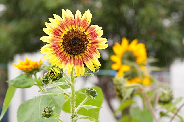
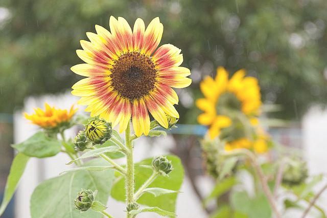
So far, it seems hard to utilize the woodfree paper to print great full color pictures. There is no good proof and art paper’s experience is not applicable. However, there are a few guidelines to follow in order to have good result on printing woodfree paper. First of all, woodfree absorbs a lot more ink than glossy art paper during the printing process. As a result, the color will look darker and all dark shadow detail will be gone. When comparing to glossy art paper, the same set of plate printed on woodfree paper will look 10~30% darker. In other to print pictures with proper color, they have to be tuned to 20~30% lighter. For example, the following picture on the left will look nice printing on glossy art paper. The center detail of the flower and the background will not be lost. In order not to lose those detail on woodfree paper, the same pictures has to be tuned as light as the one at the right hand side.
Last year, a client uses 120 gsm woodfree paper to print a booklet but most of the pictures are dark. The client’s designer has no idea how to work with woodfree paper at all. After we have seen the blue print output, we know the print out will look dark and dull if we don’t do anything about it. We have tried to communicate with the client’s designers but they don’t seem to understand. The pictures are too dark to show any detail in the shadow areas and the client is not going to like the book. In the end, we cannot convince the client to improve the source pictures but we have lightened the black plate by as much as 20% during the CTP output. The pictures look great after all.
Even though woodfree absorbs a lot of ink, the print out’s contrast is much lower than glossy art paper. The texture of the woodfree paper makes 100% black appear to be about 80% black on art paper. 100% black and dark color never looks good on woodfree paper and it affects the contrast of pictures. Thus, Woodfree paper is most suitable for pink colors and designers will pick mostly light colors. All photos will be lightened so that they have no dark shadow areas. Even though woodfree paper already has fairly smooth surface, it has its limitation. By working with around those limitations, nice full color graphics can also be printed on woodfree paper. Finally, when we output CTP plates, we will also use lower dot density to match woodfree paper’s texture. By matching the dot density, fewer dots will be lost by the rougher surface and gives sharper photos. Next time, when you see a nicely printed booklet on woodfree paper, pay attention on how carefully the designer picks the colors.